One place for logos, color rules, typography, UI patterns, and downloadable brand assets.
Built for websites, proposals, project portals, internal tools, presentations, signage, plan sheets, trucks, and future AI-powered products across the Bailey ecosystem.
Clear systems. Trusted outcomes.
Use black, blue, soft neutrals, and restrained technical patterns. The brand should feel modern, structured, and quietly confident.
Logo Downloads
Use the approved Bailey marks only. Download the correct file type for your use case below.


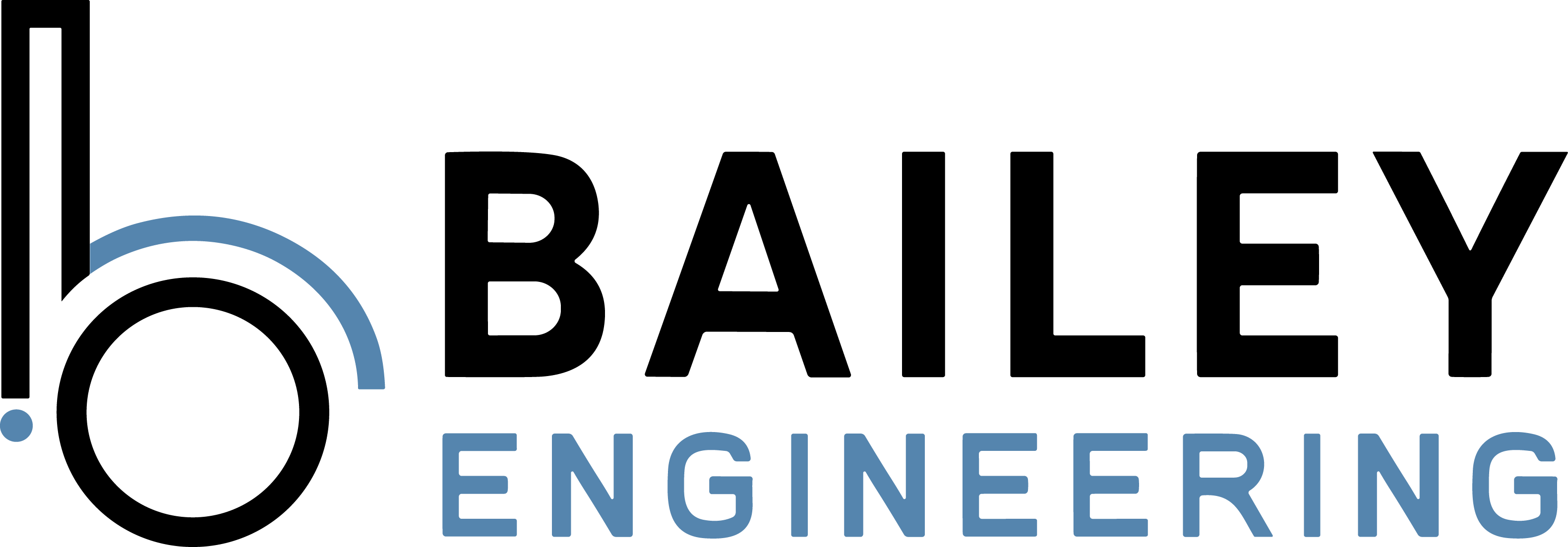
Combination Logo
Default logo for website headers, decks, cover pages, and most public-facing applications.
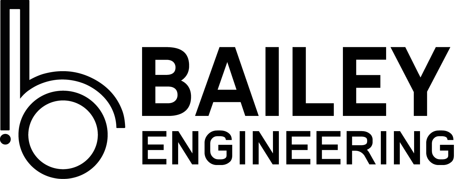
Black Wordmark / Monochrome Use
Use when a single-color version is needed for print, low-ink applications, or simplified placement.
Logo Clearspace & Minimum Size
Maintain a minimum clearspace equal to the height of the lowercase b. This protects legibility on trucks, signs, plan sheets, websites, and proposal covers.
Keep text, rules, icons, photos, and other marks outside the protected zone.
| Medium | Minimum | Note |
|---|---|---|
| Digital | 120px width | Do not go smaller on websites or dashboards. |
| 1 inch wide | Required for proposals, invoices, handouts, and sheets. |
Logo Usage Rules
Do not stretch, outline, recolor, apply effects, or place low-contrast versions on incompatible backgrounds.
Primary Palette & Website Accent System
The Bailey system uses industrial neutrals with precision blue as the primary digital accent.
| Demo | Color | Web / Print | Usage |
|---|---|---|---|
| Primary Black | #080808 | Headlines, body emphasis, logo, primary buttons | |
| Dark Charcoal | #121212 | Dark sections, overlays, hero panels | |
| Soft White | #F2F2F2 | Site backgrounds, light cards, breathing room | |
| Light Grey | #D2D2D2 | Borders, rules, disabled states | |
| Medium Grey | #BDBDBD | Secondary text, captions, metadata | |
| Precision Blue (Print) | #0054AA | Printed engineering materials and plan applications | |
| Precision Blue (Web) | #488CBA | CTAs, links, system accents, UI emphasis |
| Element | Font | Web | Tracking | |
|---|---|---|---|---|
| BAILEY | Gabarito SemiBold | #080808 | CMYK: 0,0,0,100 | AV 65 |
| ENGINEERING | AdhynathaPersonal | #488CBA | CMYK: 61,25,0,27 | AV 103 |
| Property | Accent Demo | Accent | Purpose |
|---|---|---|---|
| baileyengineers.com | Copper | Corporate authority | |
| baileyengage.com | Sage | Community trust | |
| cms.bailey.botgui.de | Yellow | Internal efficiency | |
| track.botgui.de | Status system | Transparency | |
| Project portals | Contextual | Location-specific |
Typography Scale
Use restrained, readable typography that feels technical without becoming cold.
Used for page titles, hero messaging, and strong section headers.
Used for subheads, content blocks, form labels, and supporting copy.
Use JetBrains Mono for project IDs, coordinates, status codes, and system labels.
| Element | Size | Line Height | Use |
|---|---|---|---|
| H1 | 48px | 56px | Hero titles, major headers |
| H2 | 36px | 44px | Section titles |
| H3 | 28px | 36px | Content modules |
| Body | 16px | 24px | Default paragraph text |
| Small | 14px | 22px | Captions, meta, helper text |
Website Components
Use the same core component patterns across the public site, service pages, project portals, and future product experiences.
Primary buttons use black by default. Use web blue for emphasis where needed.
White background, soft border, restrained shadow, 16–18px radius, clean spacing.
Clear systems, trusted outcomes.
Use dark sections sparingly for authority, contrast, and modern technical tone.
Focus states should use a blue outline and soft shadow. Error states use red.
CSS Color Tokens
Copy/paste these directly into a site stylesheet or design token file.